Cross Functional Partners: Web Designers / UXR / Analytics / Leadership / Front-End Devs / Product Owners / Product Managers / Scrum Master
01 • The Problem ——————
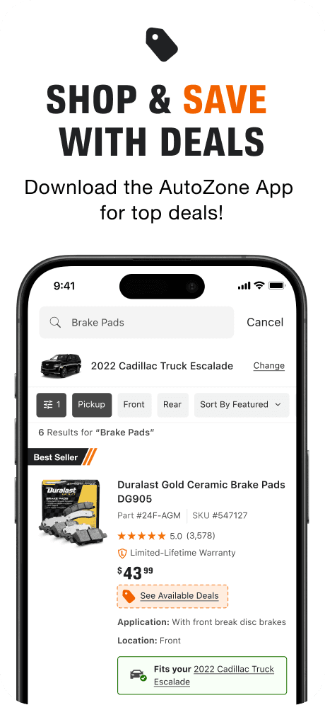
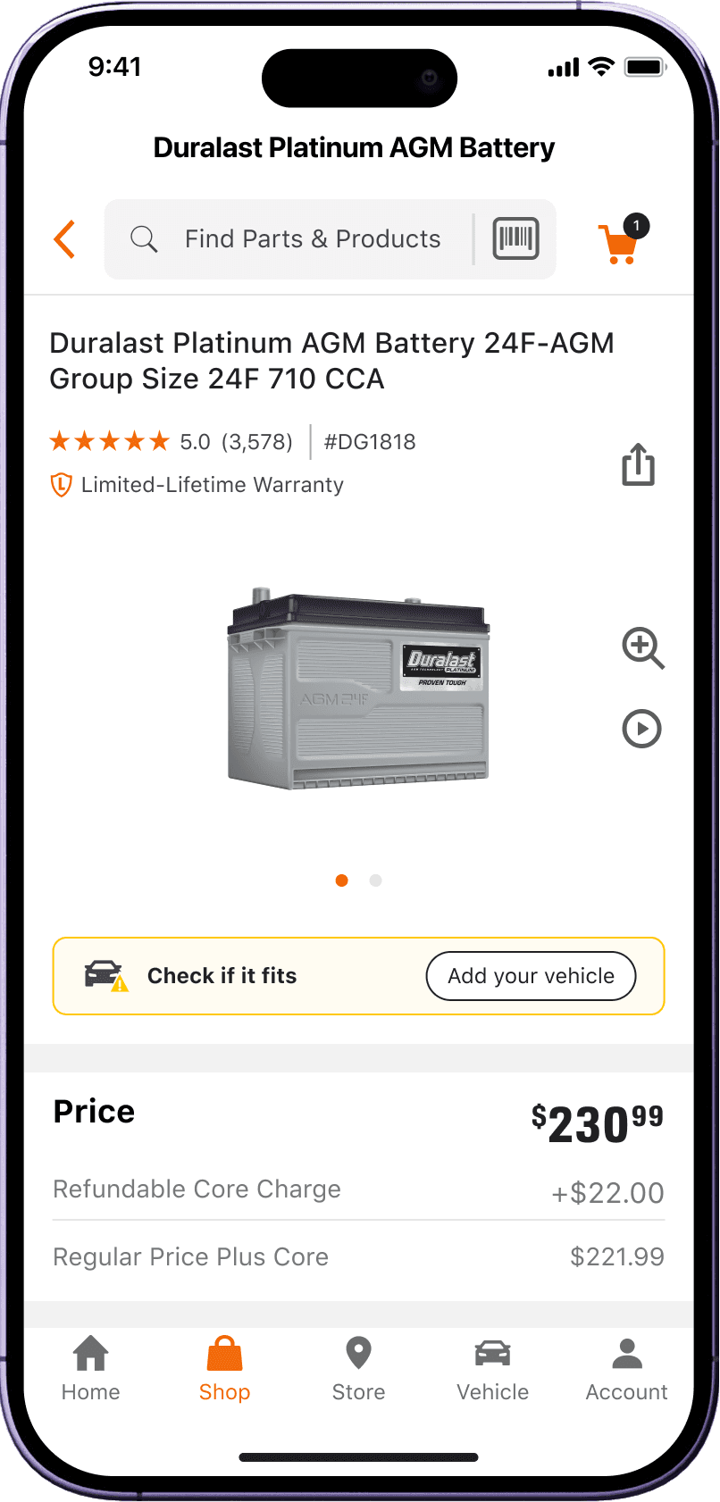
24% of customers arriving from Google to the app have a vehicle set that
doesn't fit the product they're looking for
The core irony: Google is sending people to the right product for the wrong car.
This wasn't a product clarity problem, it was a fitment communication problem hiding in plain sight.
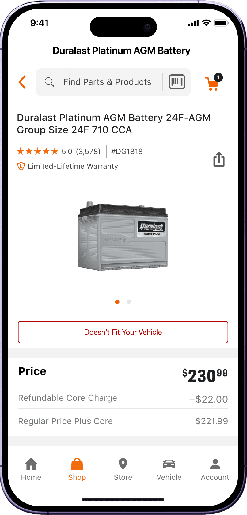
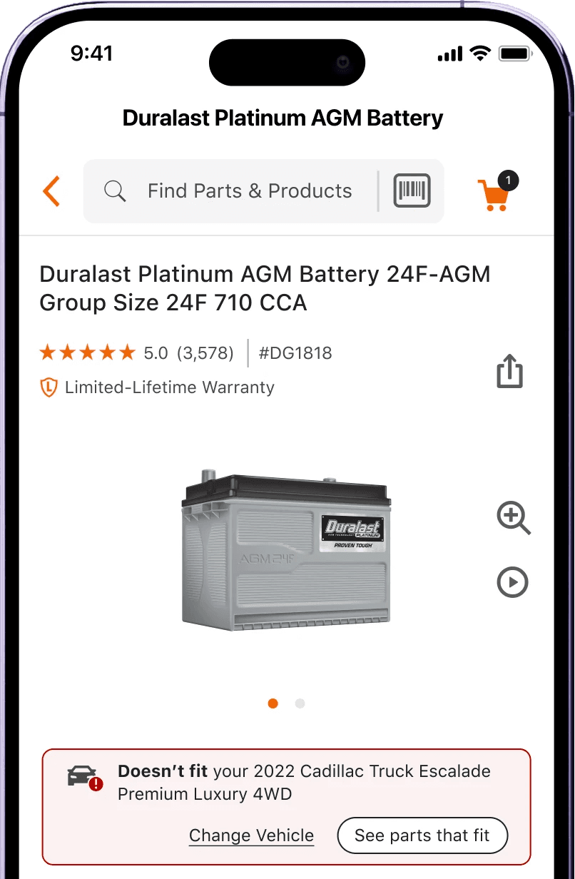
Previous dead end when deep-linked from Google
02 • Context & My Role ——————
My Role
Sole Senior Product Designer on mobile app, owning the full lifecycle from discovery through validated prototype:
Collaborated with UXR to test prototypes, drove design decisions, and leadership presentations independently.
Presented and defended work directly to design, product, engineering, directors, and VP leadership.
Scope: mobile app, PDP and Shelf.
03 • Problem ——————
Diagnose before designing.
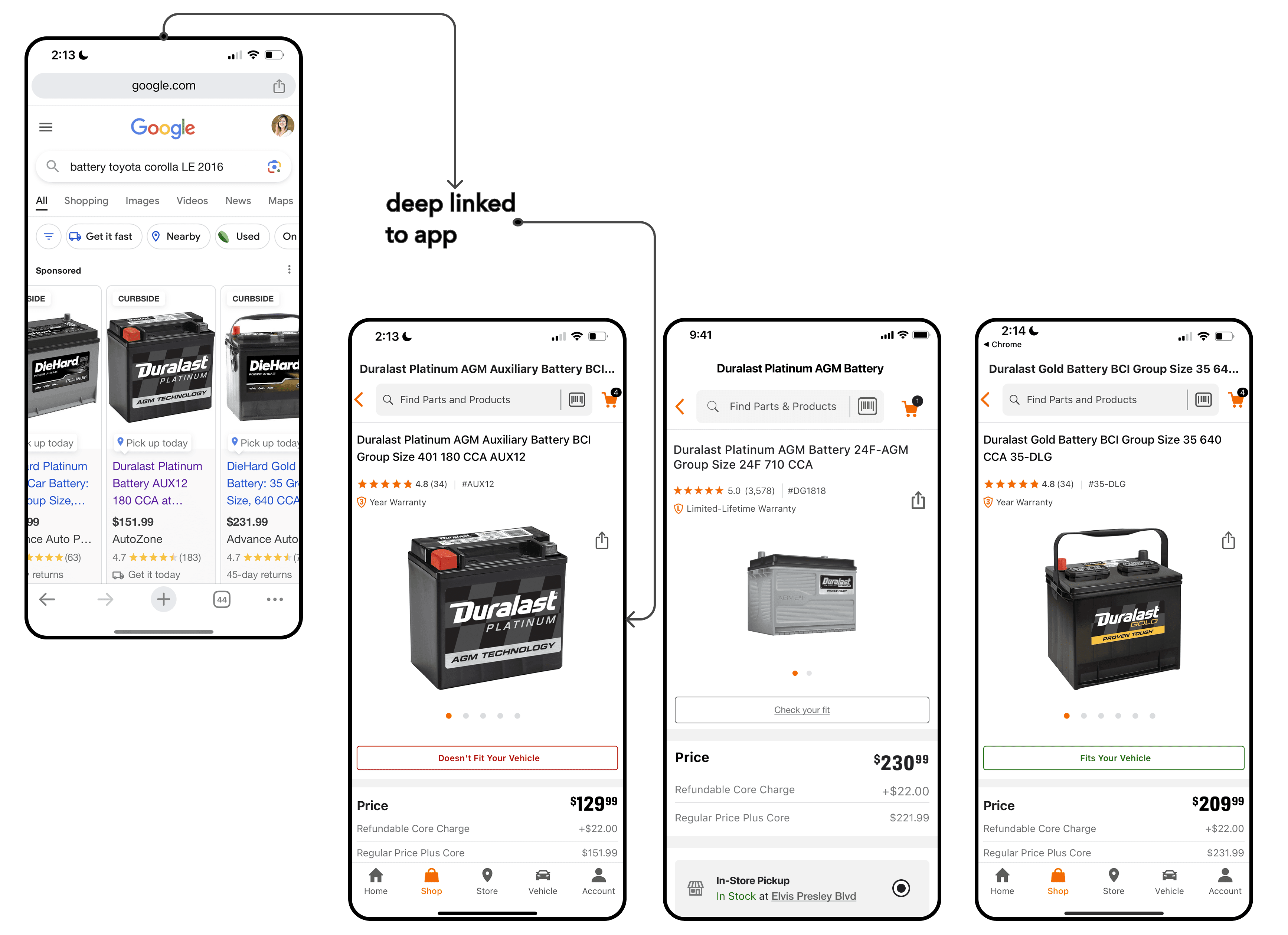
I mapped the deep-link flow: users land on a PDP from Google with a mismatched vehicle already set
Surfaced the structural cause: Google indexes pages on content, not fitment accuracy. High traffic, no guarantee of fit.
Identified two distinct user states requiring separate solutions: no vehicle set vs. wrong vehicle set.
Framed both sides of the cost: user dead ends and return risk on one side, low badge penetration and a mobile parity gap on the other
04 • Research & Competitive Analysis Research ——————
Research
Audit: Home Depot, Lowe's, Amazon, NAPA, Walmart, and Baymard Institute for fitment messaging patterns and deep-link flows:
Key insight from NAPA & Walmart: effective fitment messaging redirects without friction. It guides the user to find the correct product for their vehicle.
Validated research goals with UXR and confirmed the PDP as the right intervention point.
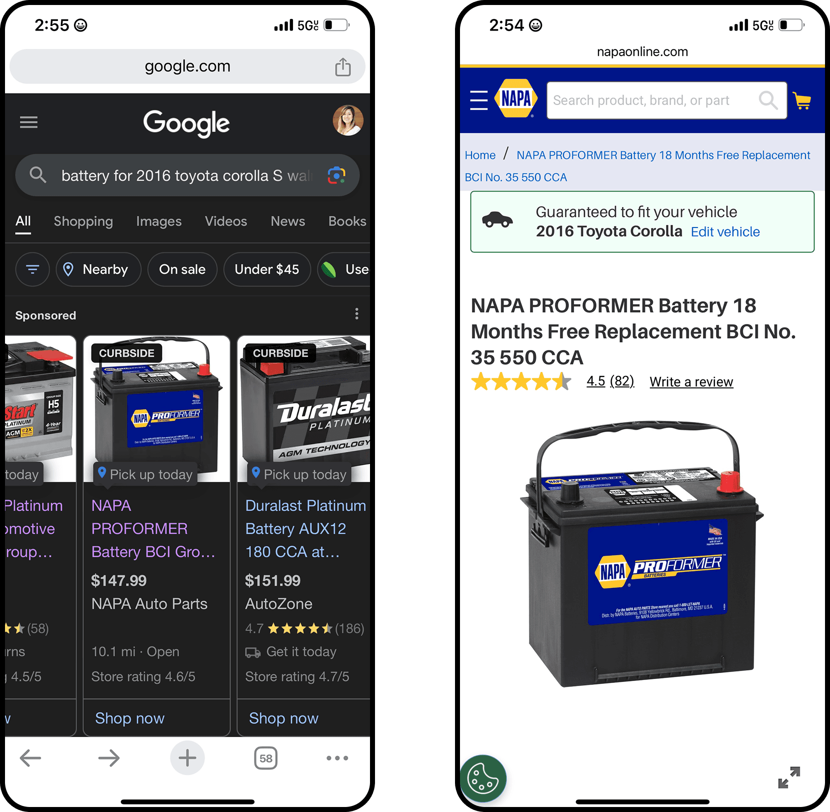
NAPA deep linking flow
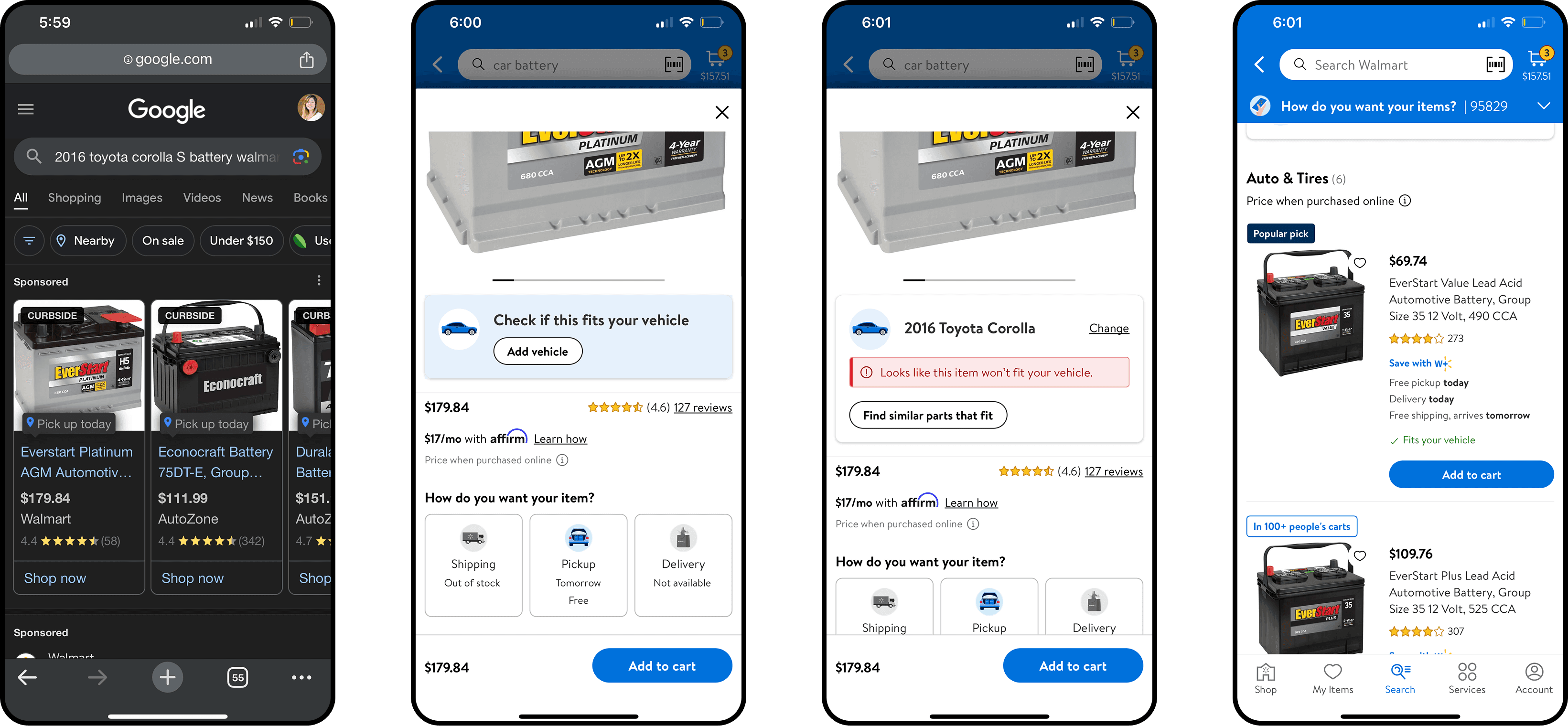
Walmart deep linking flow
Strategic Framing
Provide a Solution
Consider all states
Focus on PDP & Shelf
05 • Iteration & Leadership Reviews ——————
Design Iterations
Iterated across multiple review cycles with design, product, engineering, directors, and VP leadership.
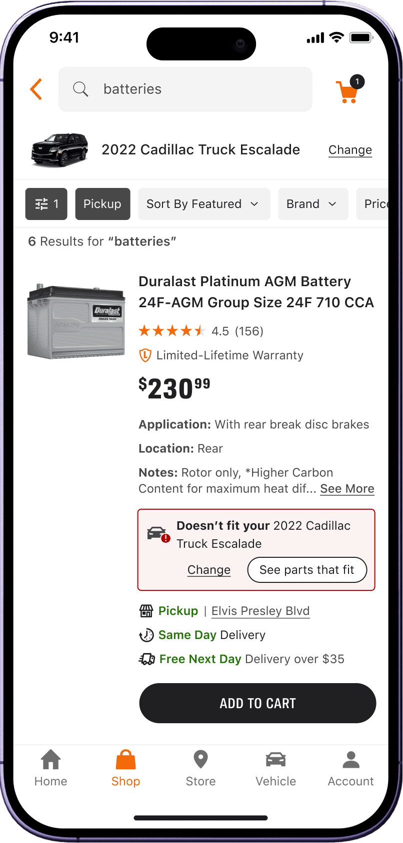
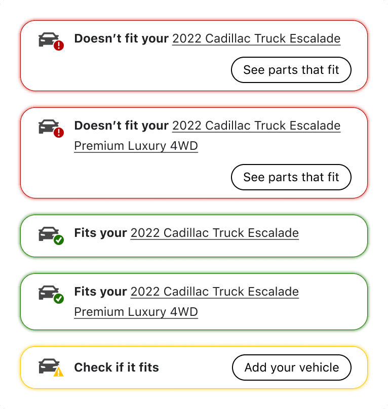
Matched color backgrounds to the site for parity, which had the secondary benefit of making "see parts that fit" more prominent
Added solid borders and held corner radius consistent for cross-platform coherence
Vehicle became a link to "Change Vehicle"
Iteration 1
Iteration 2
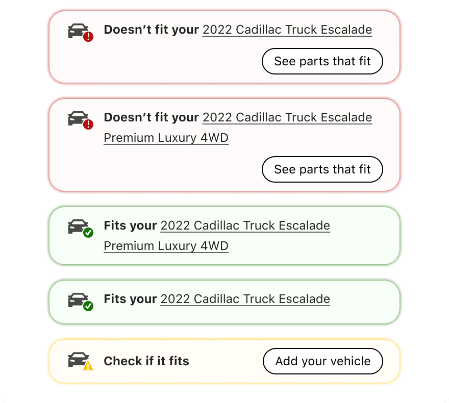
Iteration 3
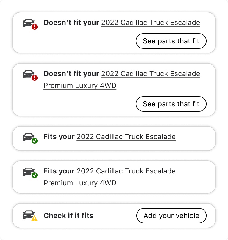
06 • Usability Testing ——————
Let's put desings in front of users
Moderated usability sessions, led by UXR in March 2024 via UserZoom, validated the redesigned mobile fitment badging and surfaced UX gaps in the Google-to-PDP back to Shelf experience. I provided the prototype flows to test and collaborated on synthesizing the insights. As a designer I wanted to understand the following:
1. Which fitment badge variation do users most quickly recognize as fits, doesn't fit, or check fit for their vehicle?
2. Do users recognize the linked vehicle name as a way to manage their vehicle, triggering the garage directly from the PDP?
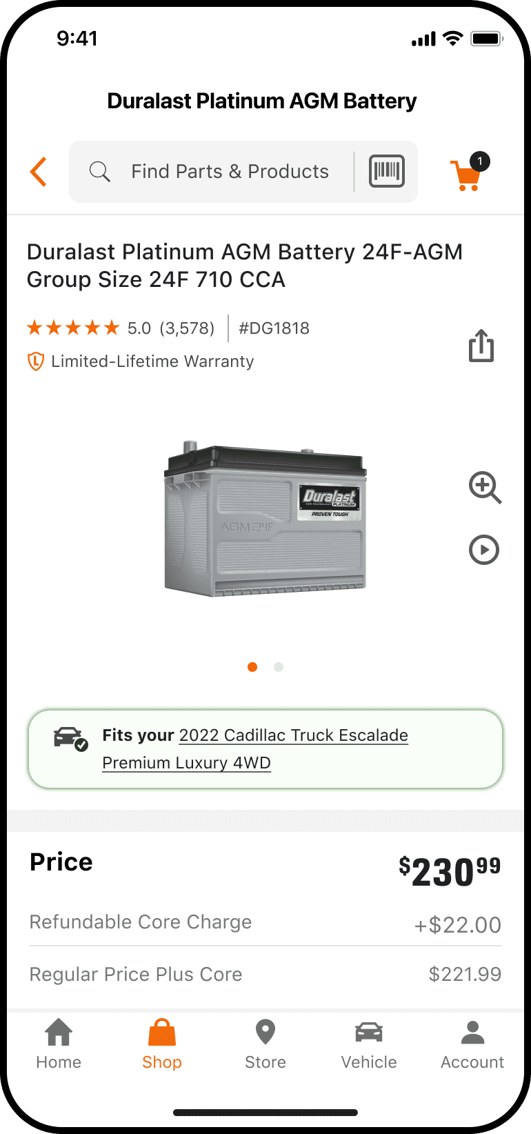
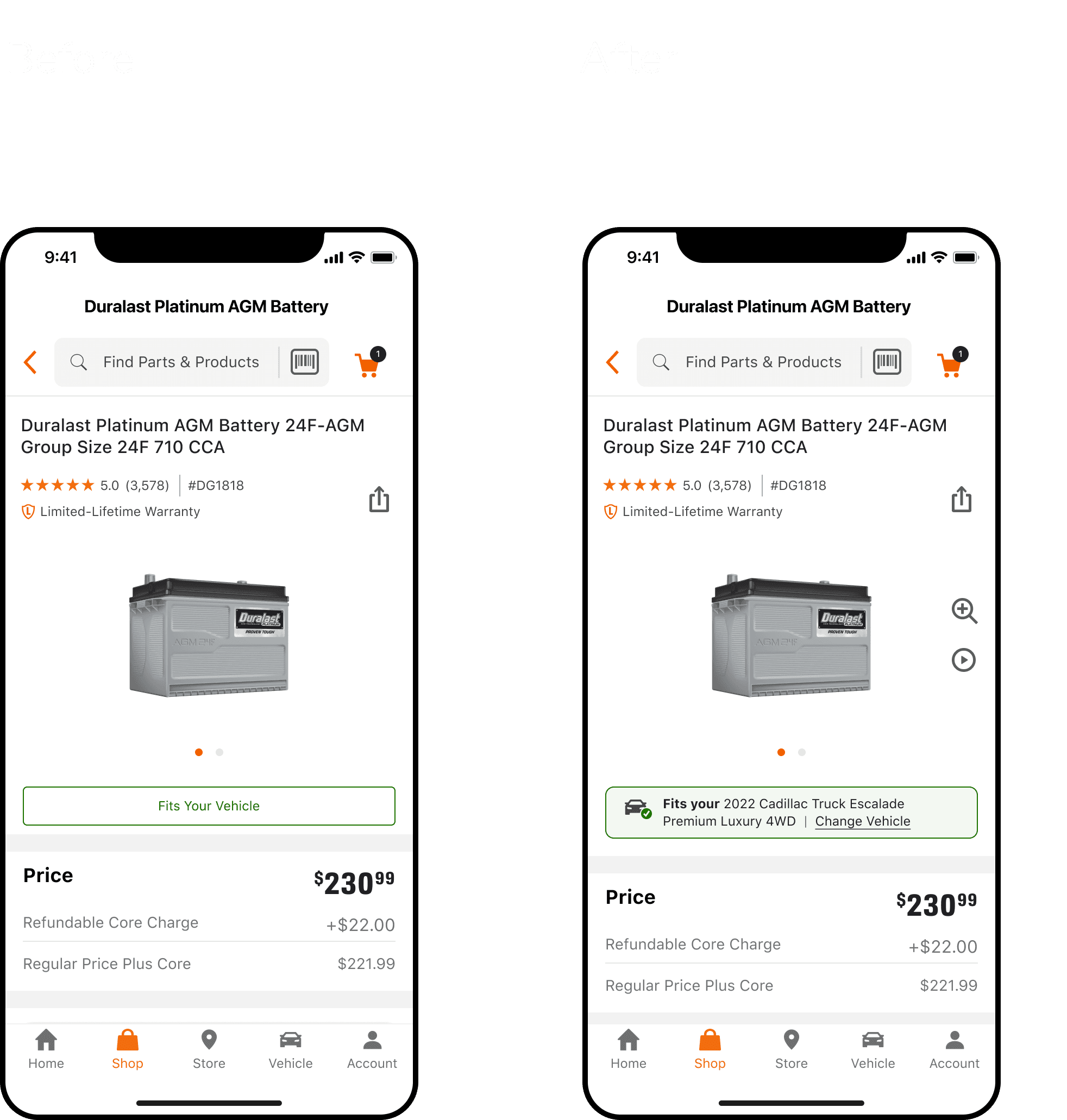
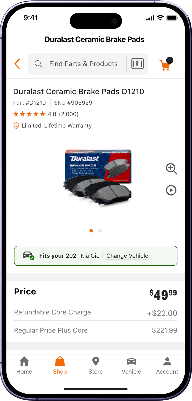
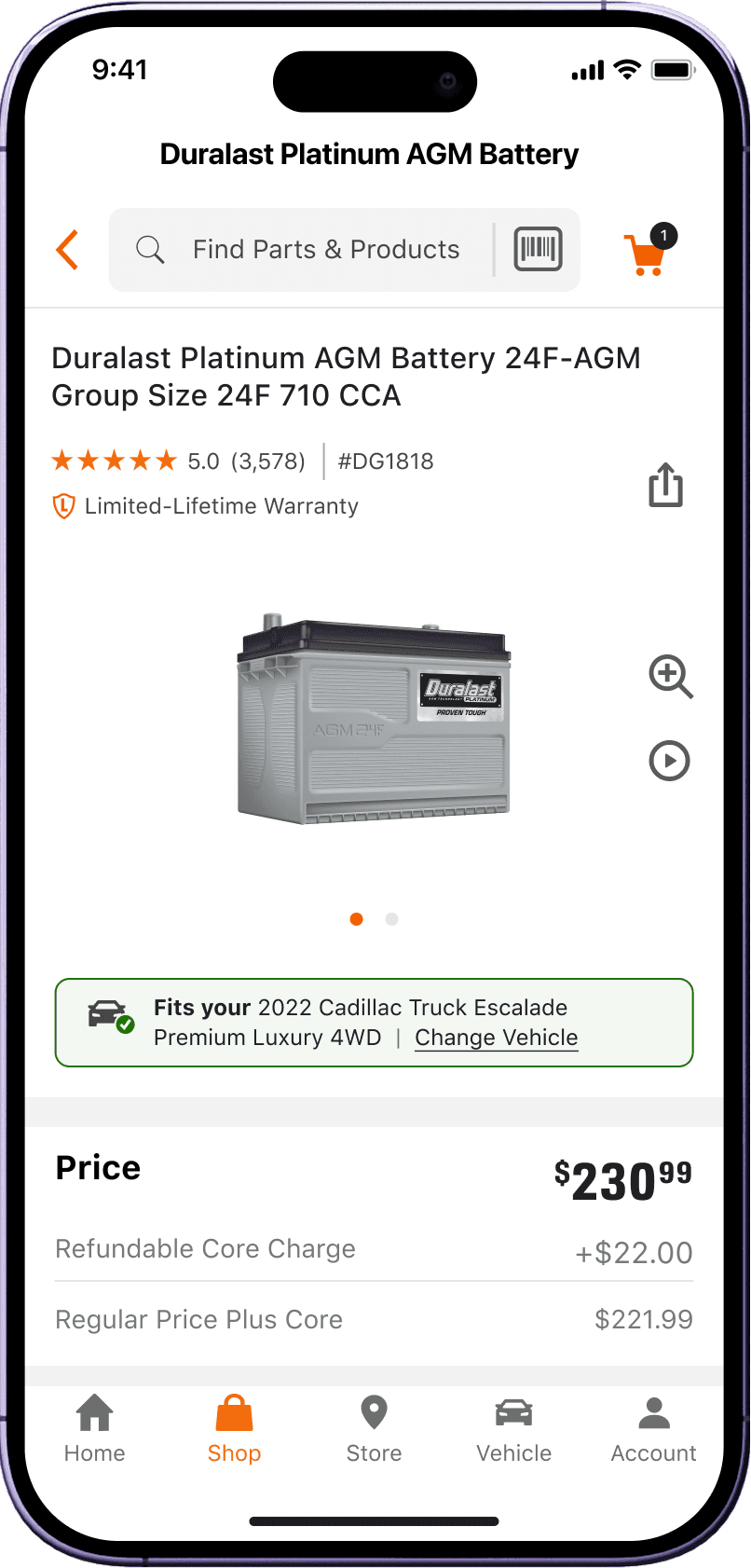
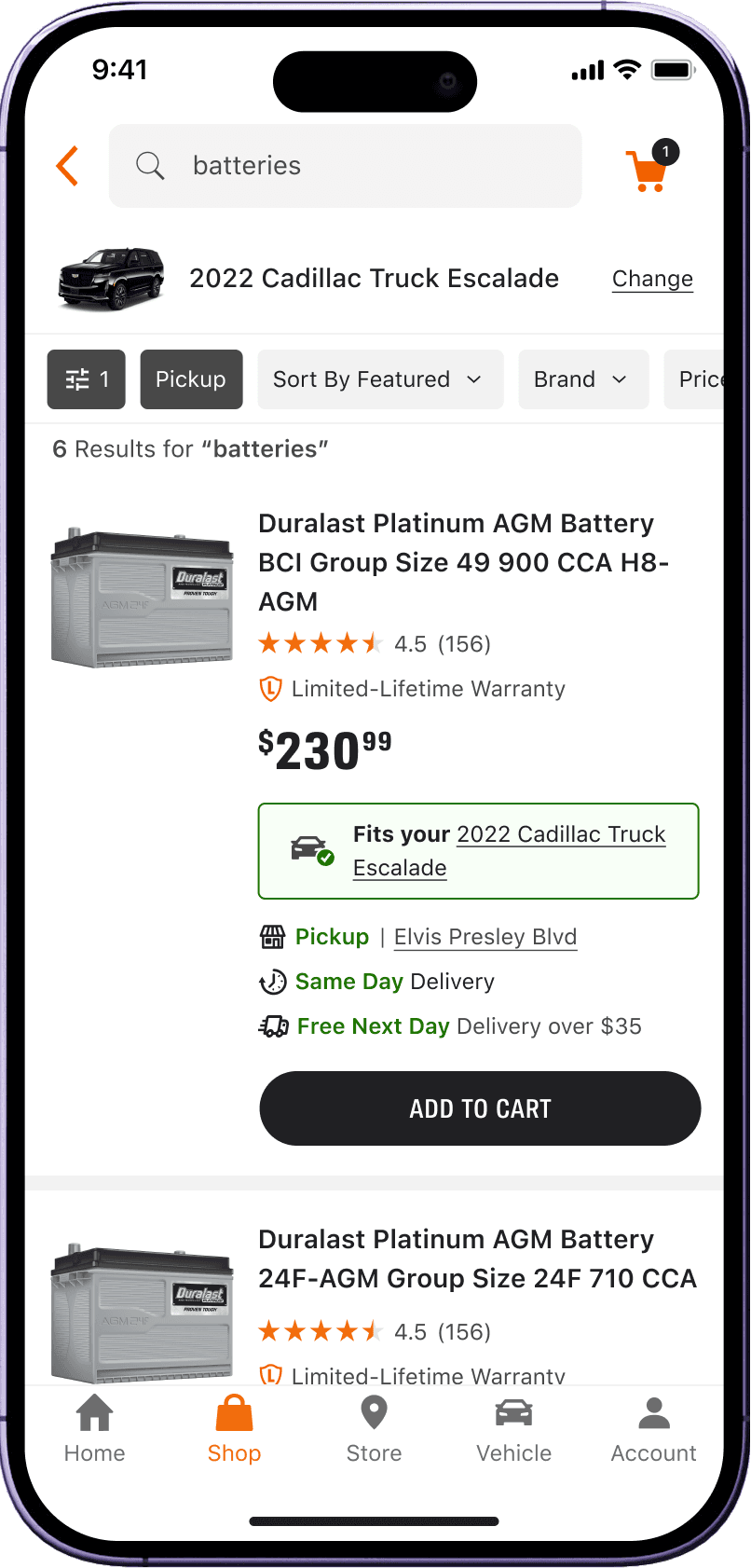
Fits
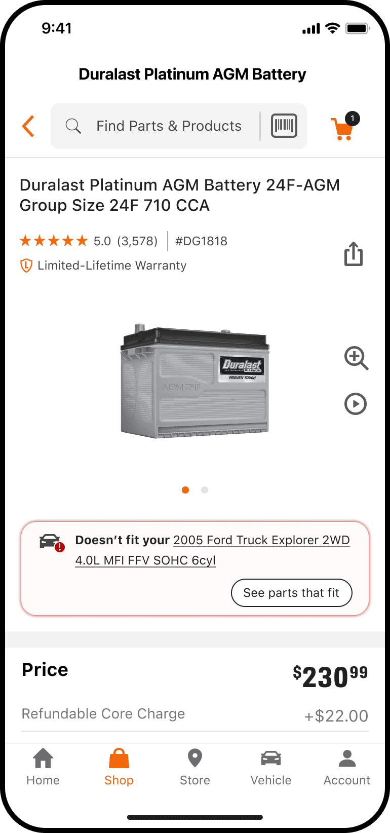
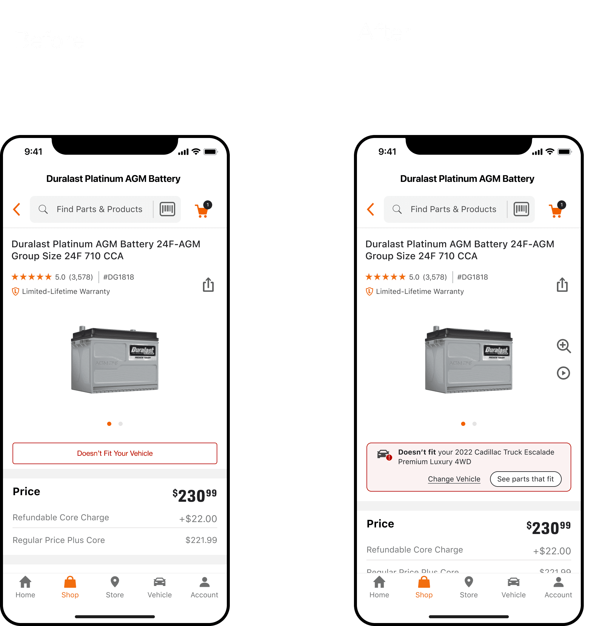
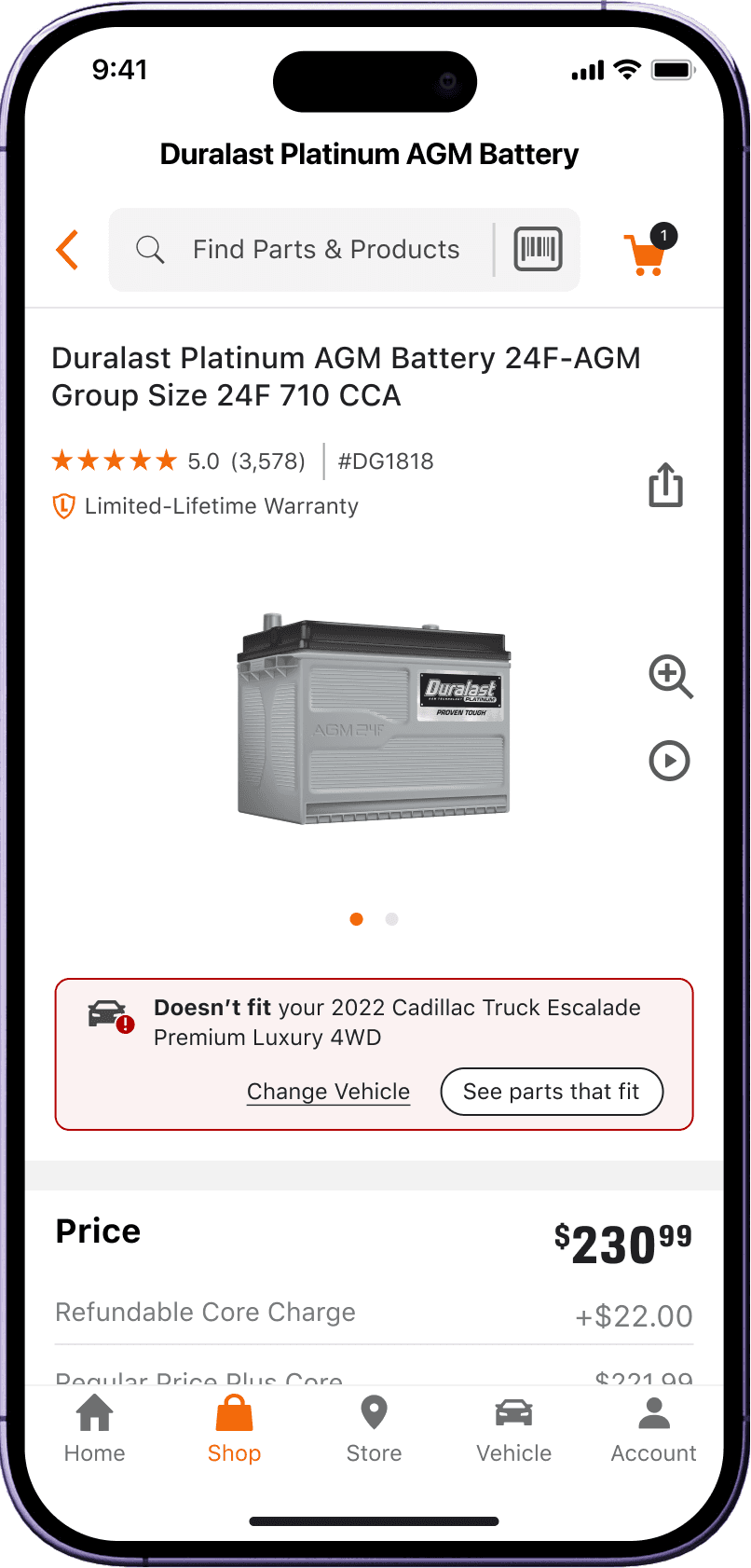
Doesn't Fit
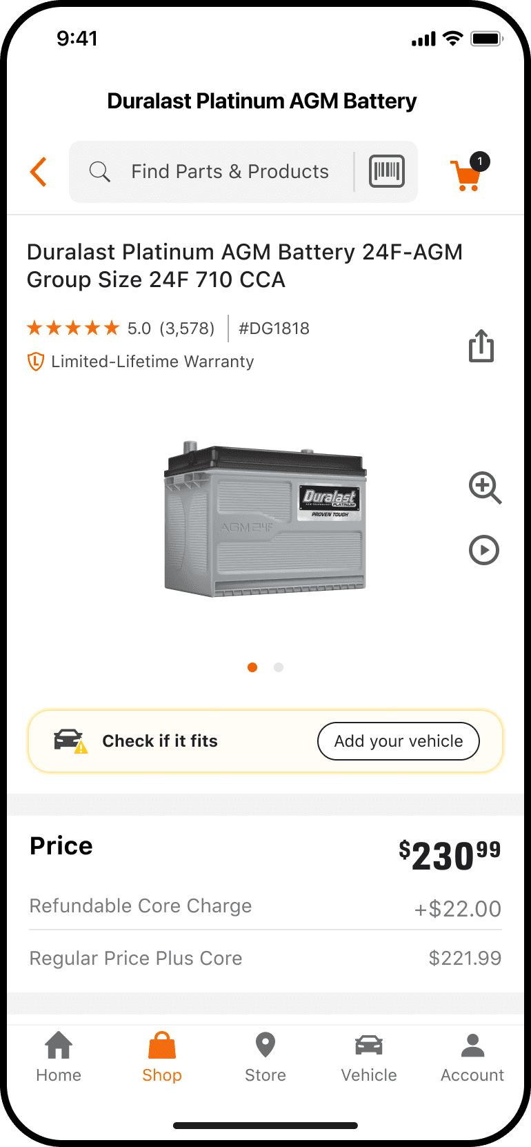
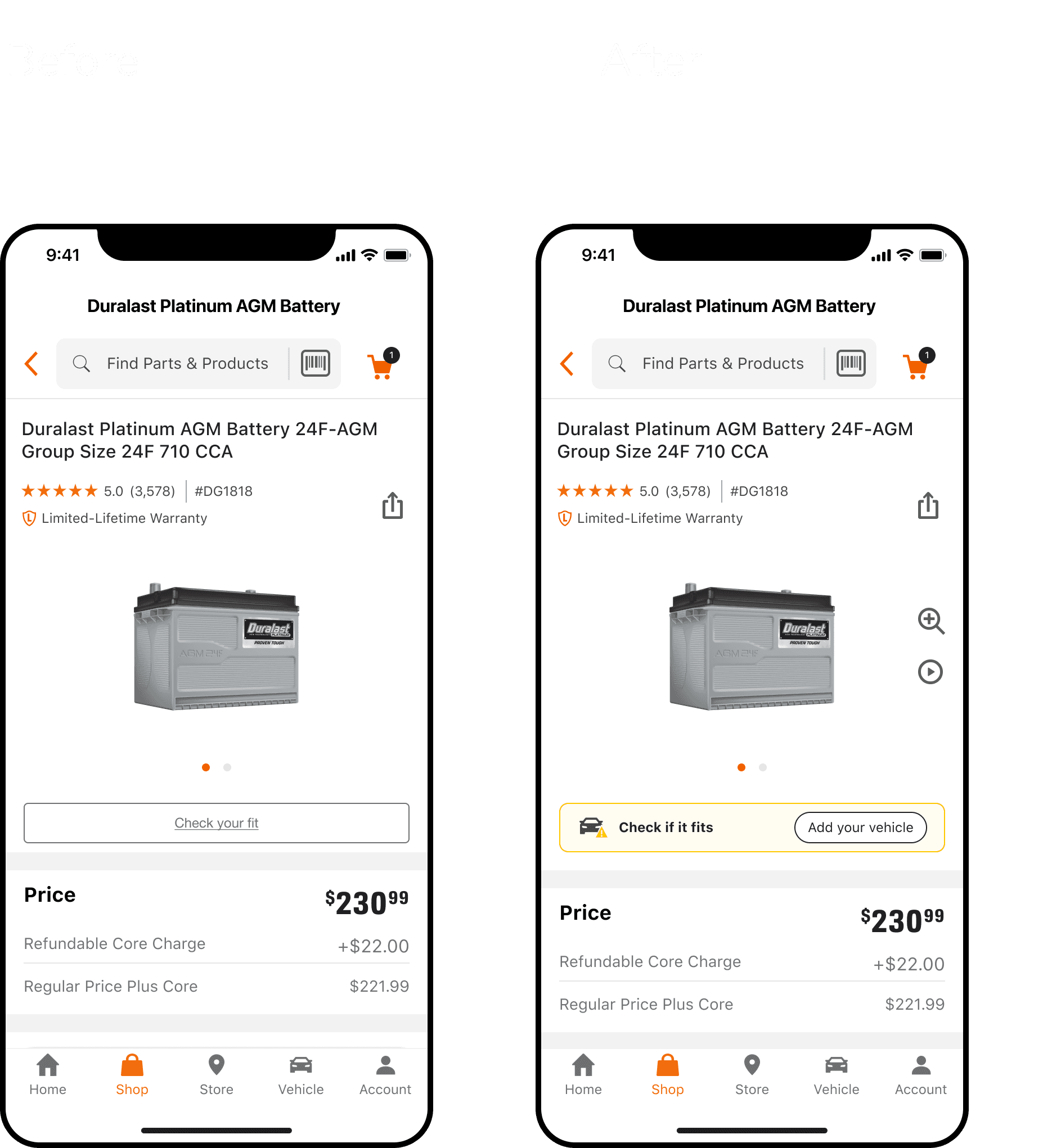
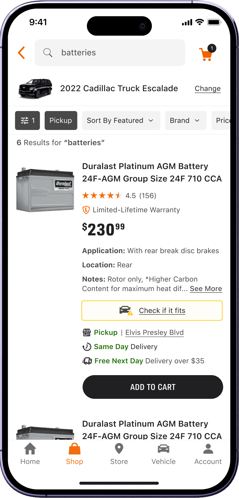
Check Fit
Results
What users told us
Iteration #2 stood out
Linked vehicles inside badges were not intuitive. Users did not read them as interactive.
"See parts that fit" tested as highly intuitive and clearly understood.
Users asked for explicit choices: change vehicle or shop without vehicle. Choice architecture mattered more than assumed.
07 • Cross-Functional Alignment ——————
Cross-Functional Alignment
Cross-functional alignment
Partnered with engineering on feasibility, flagging the behavioral complexity of routing users to a page of fitting parts.
Surfaced an analytics opportunity around "shop without vehicle" behavior to better inform that segment.
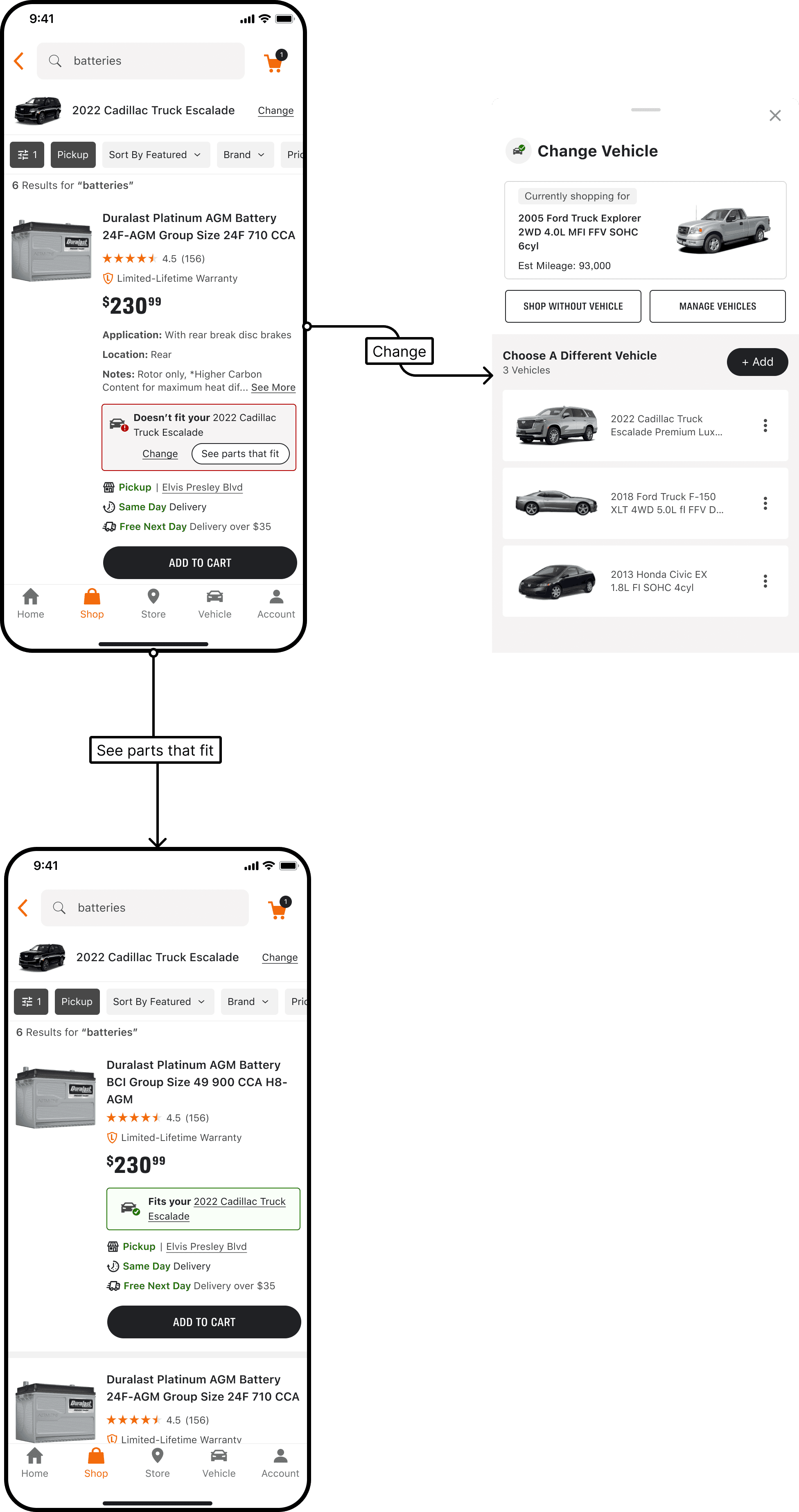
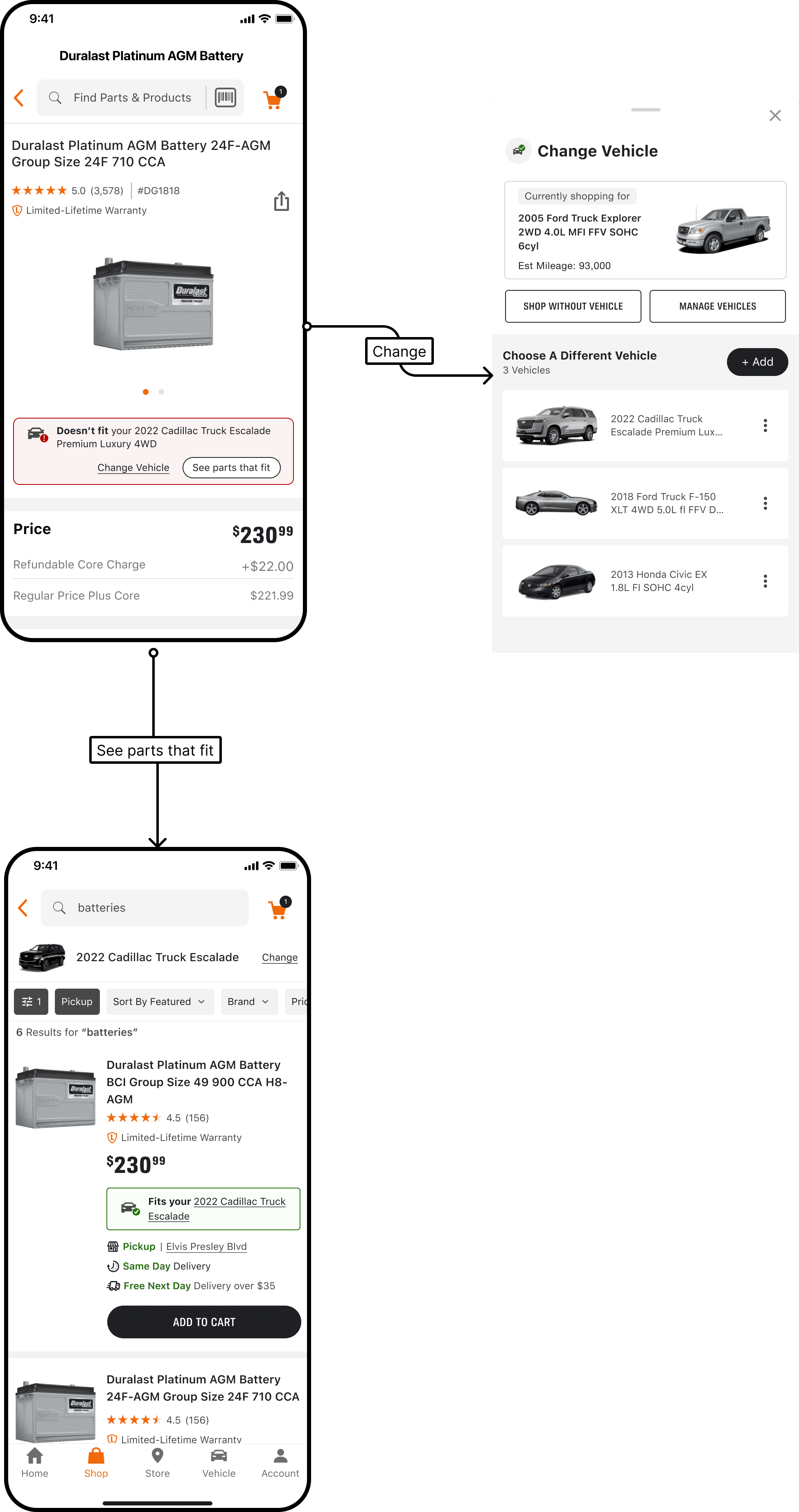
Final badge direction Locked in a consistent system across all states: icon plus fitment state. Key refinements:
Removed the glow effect for a cleaner, more credible treatment.
Matched color backgrounds to the site for parity, which made "see parts that fit" more prominent.
Made badges clickable to trigger the manage vehicle bottom sheet via "Change."
Shelf
PDP
08 • Outcome & Impact ——————
Impact
$75.1M in fulfilled mobile sales attributed to the redesign
Fitment badge penetration grew from 16% to 19%
Users no longer hit a dead end on PDP. Every fitment state now offers a clear, low-friction path to the right part
Fitment is now an acknowledged strategic focus across the org. This work helped put it on the roadmap
09 • Reflection ——————
Reflection
What I would push further: fitment parity on Cart in addition to PDP & Shelf.
What the project reinforced: iterating through leadership, not around it, builds better outcomes and faster alignment.